Where does brutalism arise?
Brutalism as a movement began in the 1950s with its heyday in architecture from the 1950s to the 1970s, but has recently re-emerged in modern digital design area.
Its beginnings can be traced back to the end of World War II. Many buildings in the United Kingdom were destroyed after the war and the country needed to rebuild them to provide shelter for displaced people and restore the order.
Designers who gave birth to Brutalism emerged in response to this situation. Because of the scarcity of materials due to wartime expenses, they used cheap, pure, untreated materials, but with striking features to give the buildings a sense of exclusivity and greatness.
Buildings with concrete facades and extruded sections begin to appear all over the country: the Hunstanton School, Smithson Square in the City of Westminster, the Balfron Tower and the National Theatre.
Over time it spread around the world, especially in institutional buildings. In an issue of Architectural Digest magazine in 1953, the term “New Brutalism” appeared for the first time, and this is when the name was given and this worldwide movement was officially born.
It is a kind of controversial style which evokes reactions, for better or worse (despite its popularity, brutalism could never escape its association with totalitarian regimes). So if you want to adopt it in a design project, it’s important that you are aware of what you’re getting into.
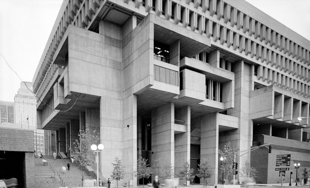
Since 2014 websites with a brutalist style have been published with very different pretensions. In fact it is complicated to highlight own characteristics that define this movement, as they vary between different designers and media, although later we will try to give a small list.
This movement is characterized as a youthful rebellion against corporate styles such as flat design or material design. The appeal of this rejuvenated style seems to be its robustness and lack of concern for appearing easy or aesthetic.
Brutalism tends to describe a mentality rather than a visual style. Brutalism does not keep secrets, nor does it seek to appear what it is not, it embraces transparency and honesty. It moves away from the corporate and commercial. Instead of following the canons of beauty to fit into society, it embraces the truth as it is, without makeup.
The adoption of the term “brutalism” to describe digital design originated with Pascal Deville, co-founder of the creative agency Freundliche Grüsse, who created brutalistwebsites.com to catalog the new phenomenon he was witnessing.
Brutalism in design
In last years, brutalism has araised in the most unsuspected area: digital interfaces. Brutalism in web design started out being overall functional: one of the most famous brutalist sites is Craigslist, whose appearance has hardly changed since the 1990s.
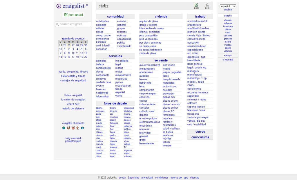
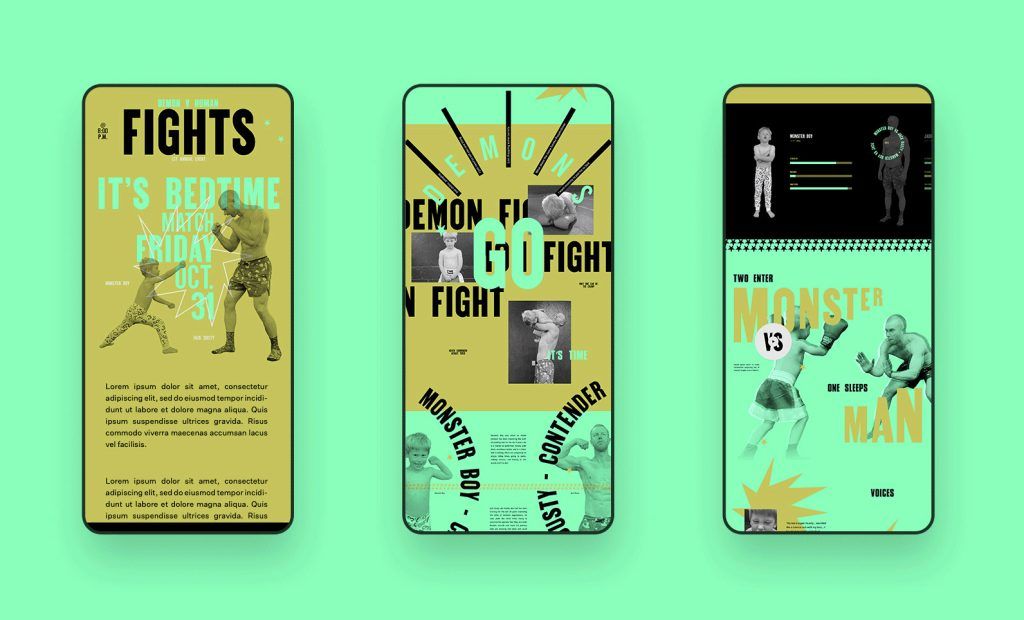
Intentionally or not, whenever web designers focused on creating simple, unpretentious and useful interfaces, they took a brutalist approach.
Some of the visual features that define brutalism may be:
- For web sites, HTML is used, with no default style.
- There is no defined color palette, often using white, black or shades of gray.
- Focus on functionality rather than form.
- Modular and repeated design elements.
- Unedited design elements
Brutalism in the modern era of design is rooted in the ideas of its architectural ancestor. Like concrete slabs, digital brutalism reveals the empty screen that other designers would try fill with color or texture. Like the rough edges of buildings, brutalist websites eschew all editing, displaying default typefaces and untreated square photos.
A recurring feature of classical brutalism is the imposing nature of its gigantic stone buildings. In digital design, digital product designers often interpret it with oversized typography as we see in the following image.

Brutalism and minimalism
Brutalism may seem to be a style from minimalism and in some ways they are similar (both adopt a less-is-more approach), but there are some key differences. Minimalism does not go to the extreme of renouncing aesthetics, while brutalism does not pay attention to following certain design patterns that guarantee its success. In website design, brutalism gives priority especially to content.
For example, a minimalist website designers will still take care of every detail related to spacing, hierarchy, symmetry, color or typography, aiming to balance simplicity with beauty, so the details still matter. Whereas a brutalist website may appear to completely discard interface styling with plain white backgrounds or system default fonts.
Categoría/s: Graphic design



Leave a Reply