
Brighton burger is a fast food chain with very strong roots in the American 70’s. Nostalgia and a familiar and fun encounter is what everyone who enjoys its facilities will find.
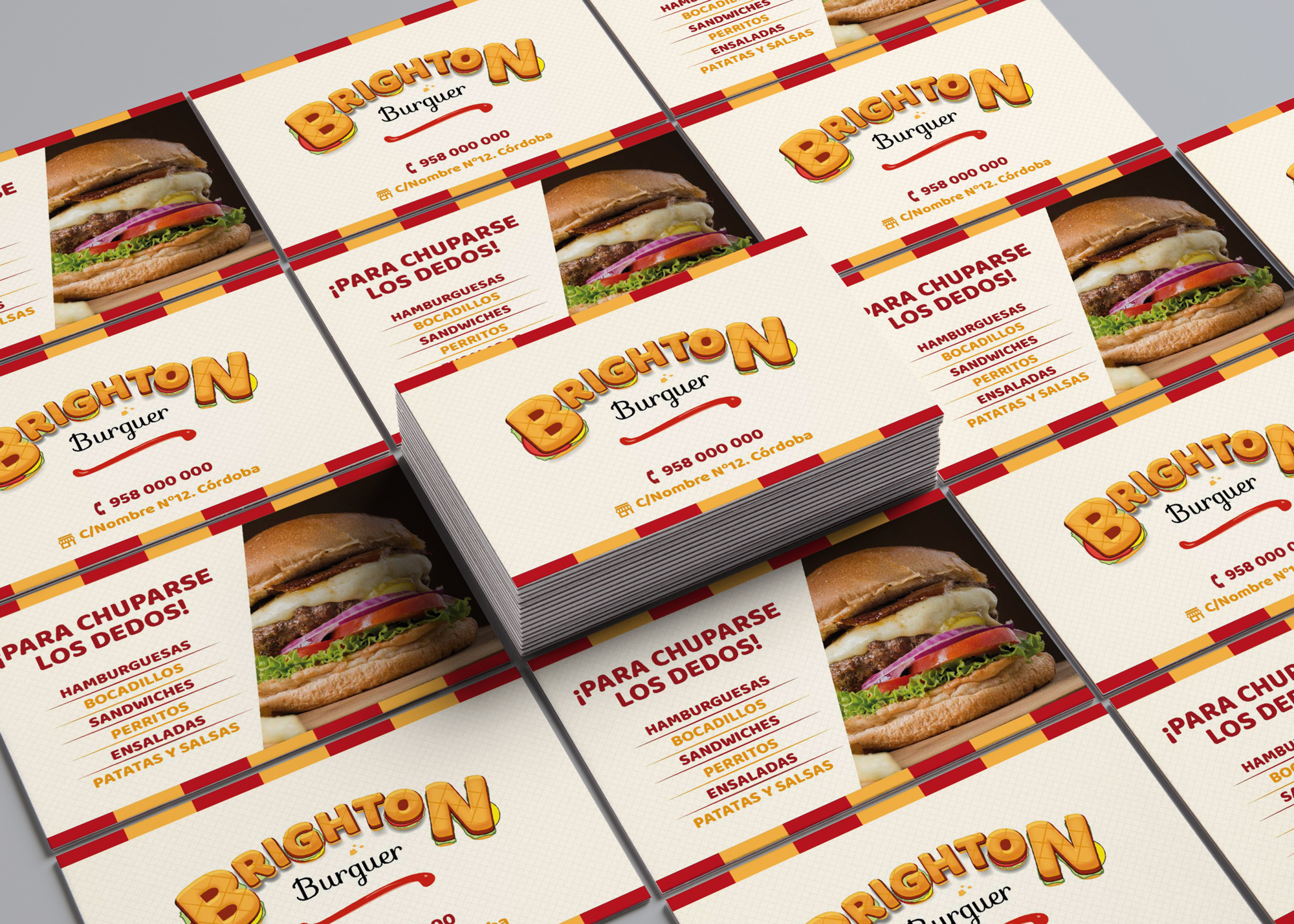
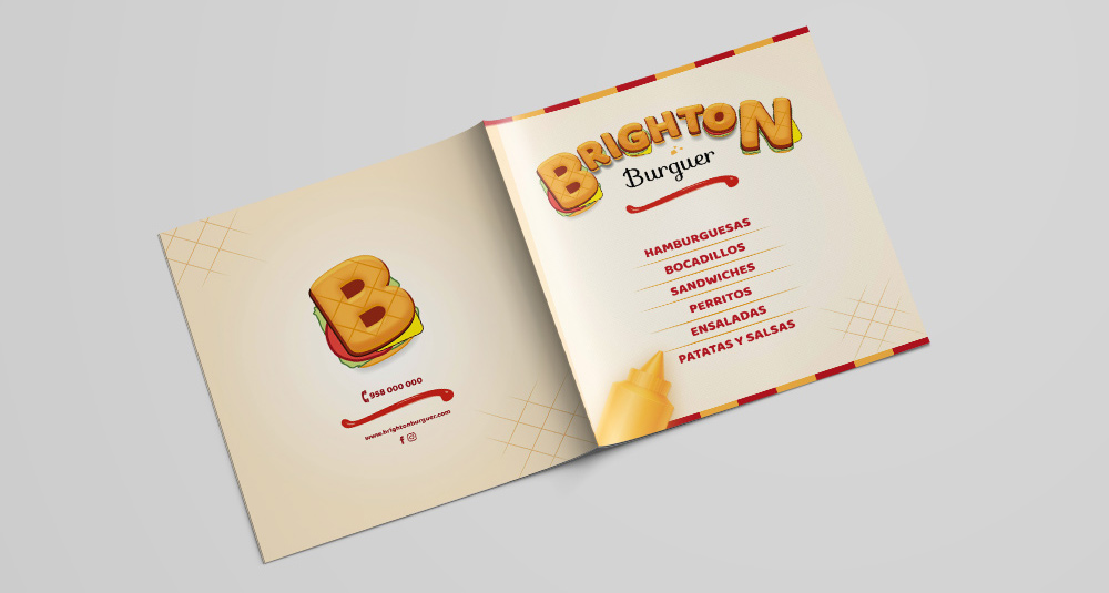
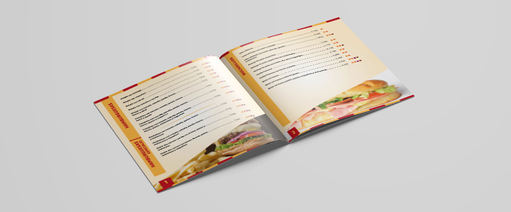
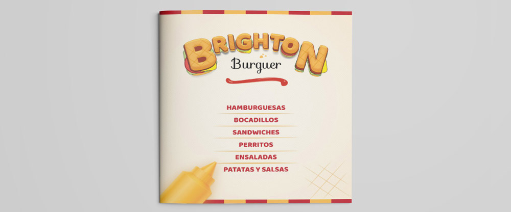
For the design and printing menu we followed a retro and eighties line, with bright colors. We used an easy to handle printing support, far from refinements, which makes it close and familiar.
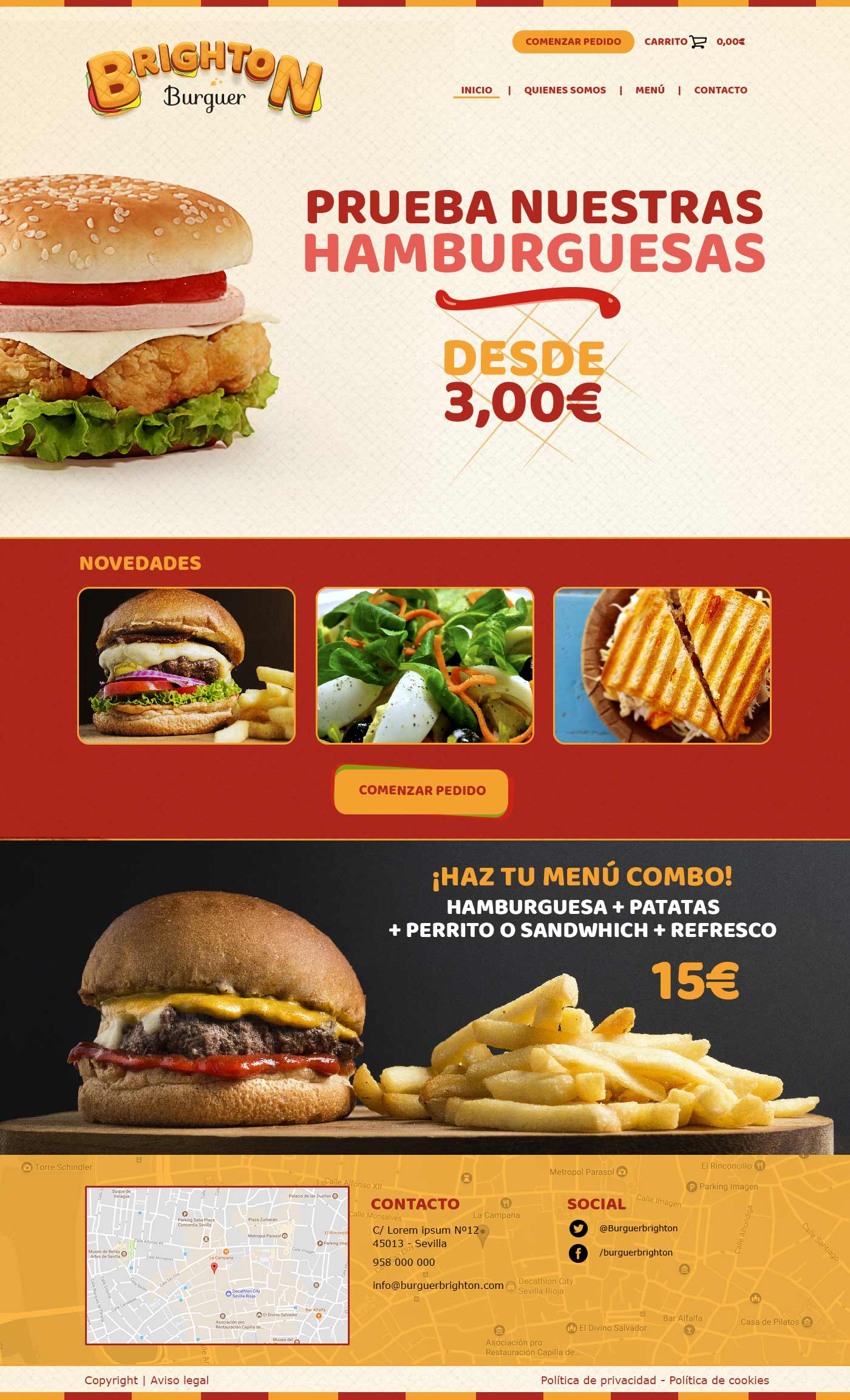
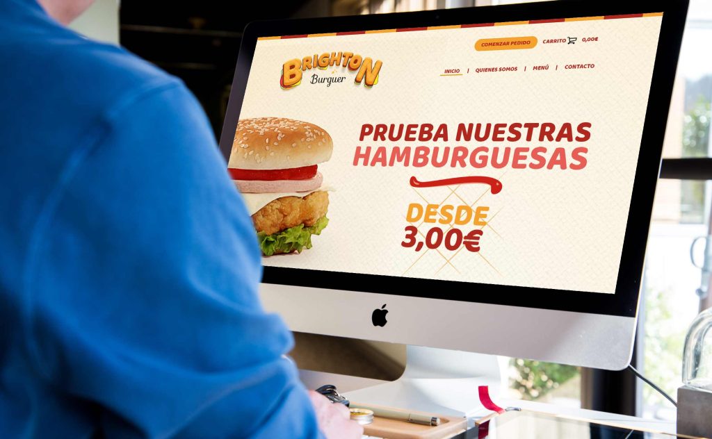
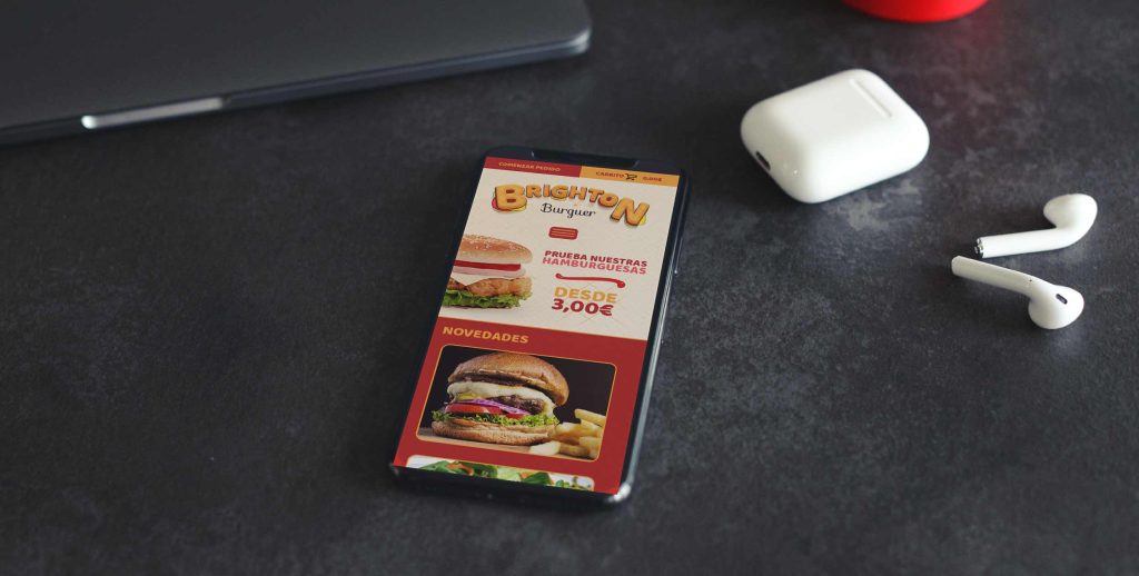
In addition to informing users about products and promotions, the web design includes the option to place home orders.
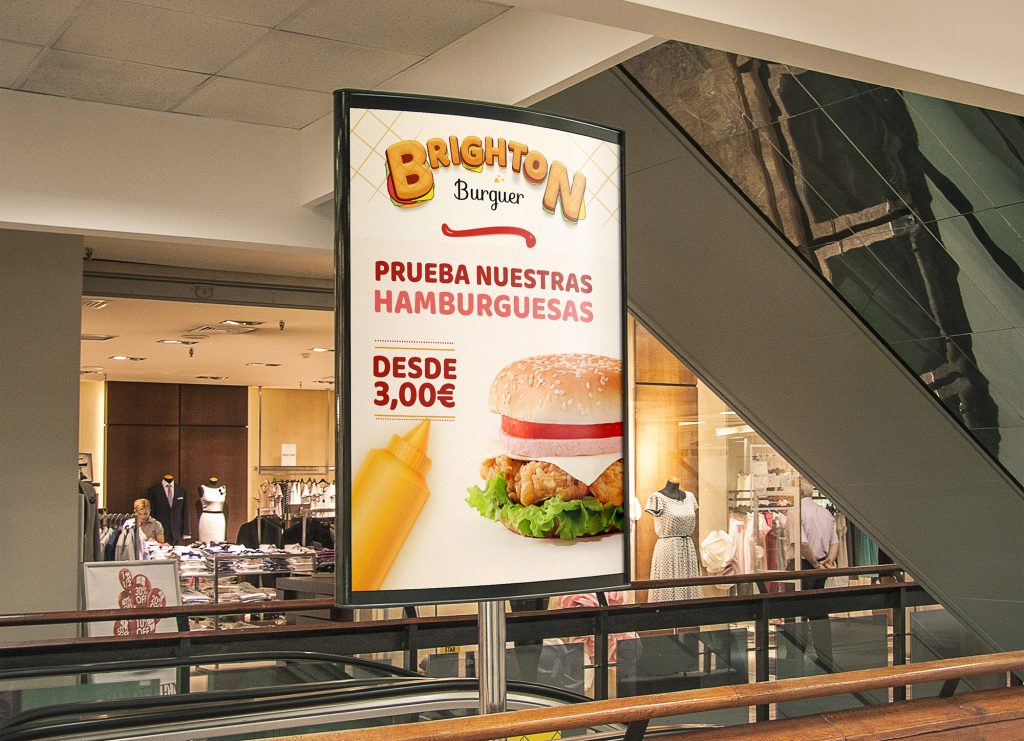
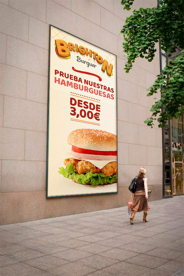
In the outdoor advertising campaign, products are promoted at low prices, with attractive images for the eye and the stomach as a lure.
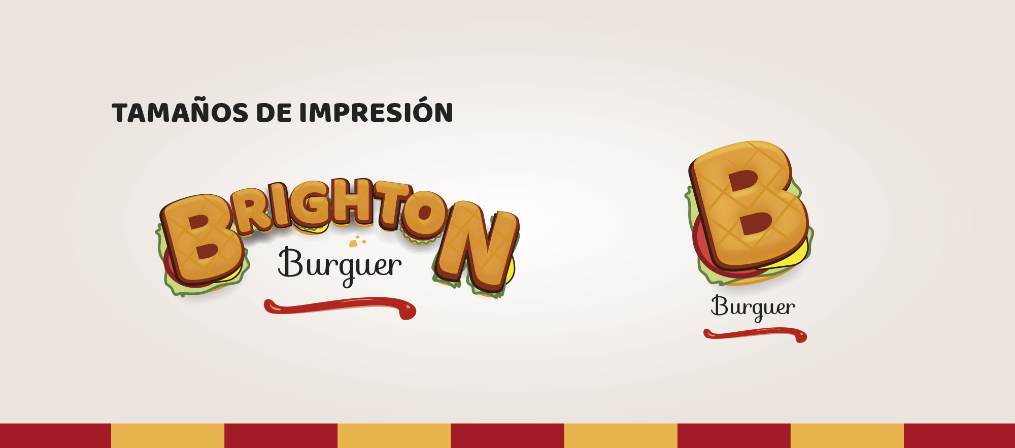
Personal branding project, which creates the image of a new burger that offers a family atmosphere inspired by the American 70s. Nostalgia together with a familiar and fun encounter is what everyone who enjoys its facilities will find.