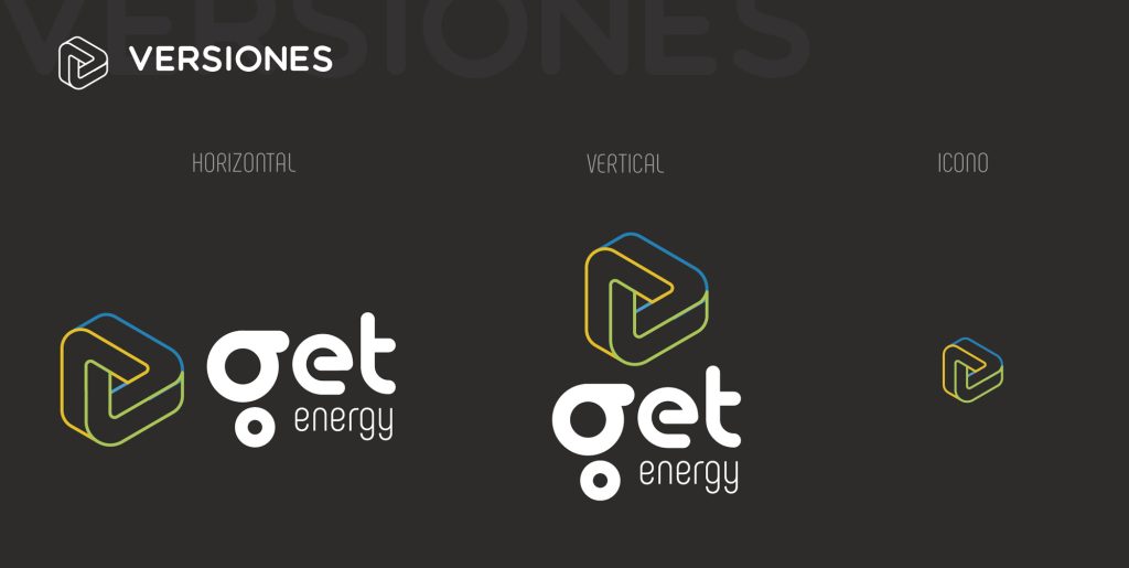
Main graphic mark. The horizontal version should be used whenever possible and if the support allows it.
Logo in one color version in positive.
Logo in one color version in negative.
Concept
The concept on which its visual image was developed was the transformation of energy, “Energy does not run out, it is transformed”, an endless cycle, which we must and can take advantage of thanks to technological advances, always having as a maxim the respect for our planet.
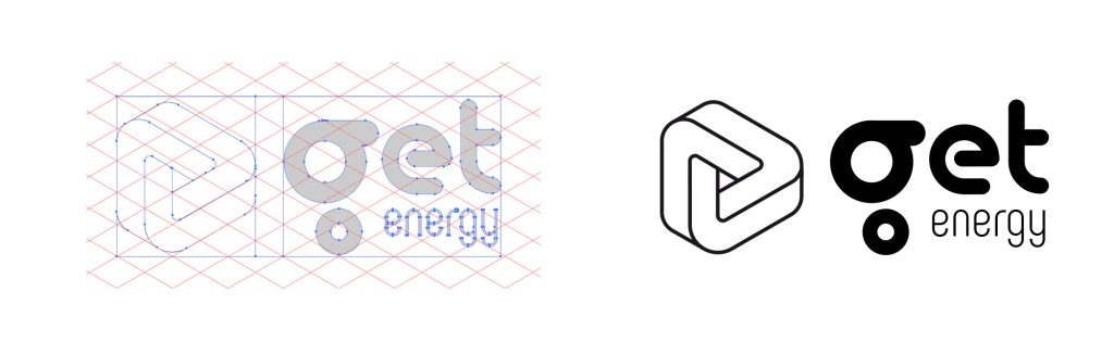
The logotype can be used in horizontal or vertical version, being preferable the horizontal one. At reduced sizes for printing and display on screens, different versions will be used in which the name of the brand and an increase in the thickness of its stroke will be dispensed with, as specified in the corporate image manual.For the construction of the anagram, 120º guides were used between them, achieving an isometric perspective.The typography used conveys the values of innovation and closeness and respect for nature. For these reasons we chose a typography with geometric and circular strokes, with a noticeable weight.
Iconography
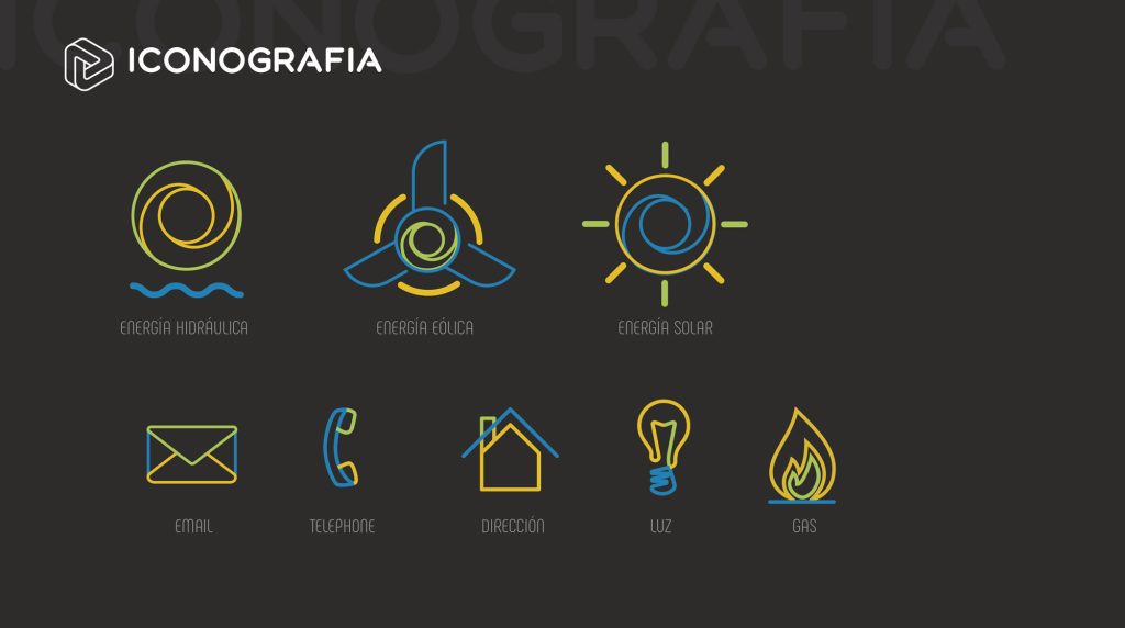
We created an iconography of the services offered by Get energy such as wind, solar, hydraulic energy and more common elements such as email, telephone, etc… following the graphic line of the anagram.
Iconography created for the different services offered that reinforces the visual system of the brand in the different advertising campaigns.We used the 3 main colors of nature (water, solo, earth) for the anagram on a dark background to achieve a strong contrast and highlight the liveliness and “energy” of these colors.
Naming
The name Get energy comes from the philosophy of the service offered “to get and transform energy in a cycle without limits” to make it accessible to all and revolutionize the way it is consumed.
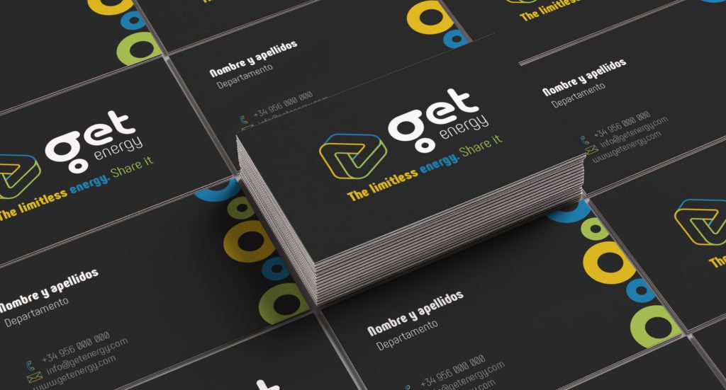
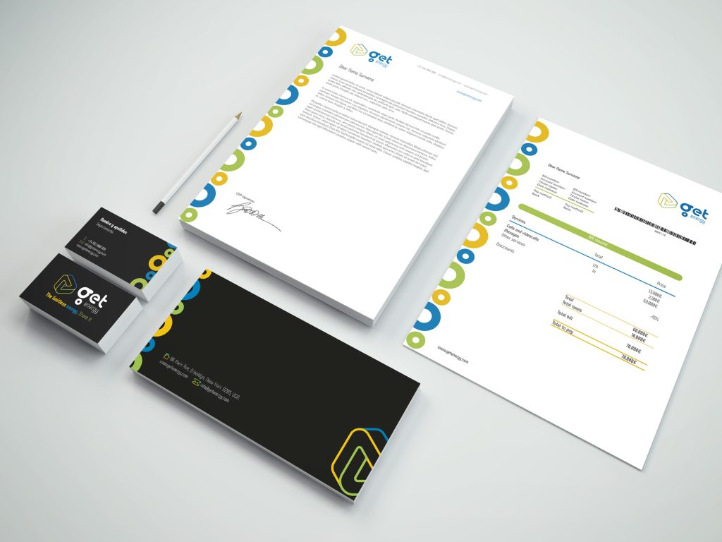
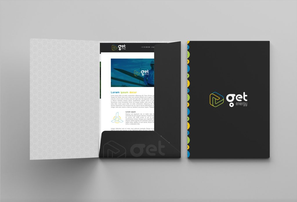
Business cards for employees and company representatives.Sheets, envelopes and cards as part of the company’s stationery.Design of corporate folder for the presentation of projects and relevant documentation.
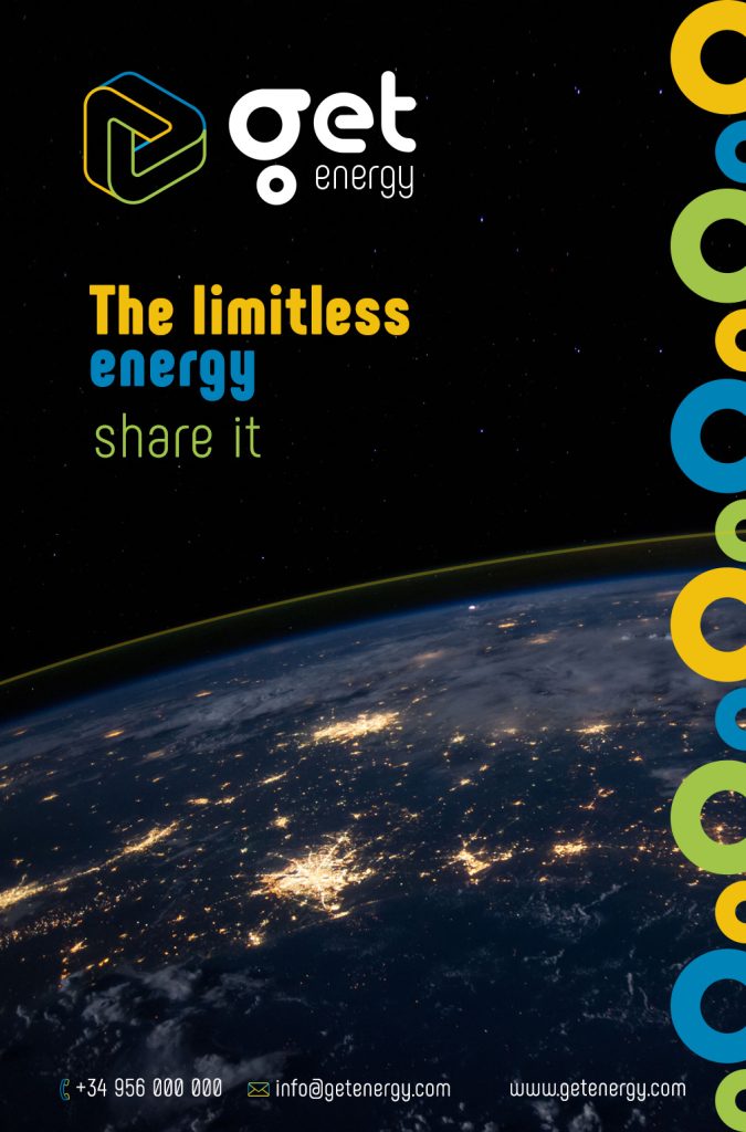
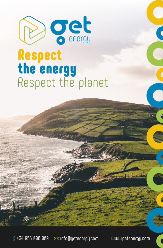
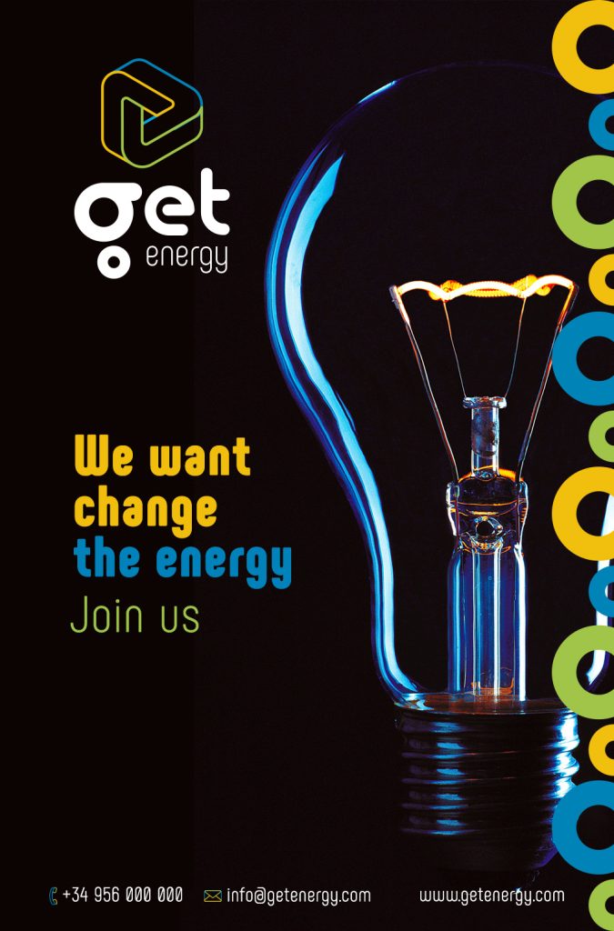
Advertising piece for MUPIi, magazine page, flyer, etc…
Advertising piece for MUPIi, magazine page, flyer, etc…
Advertising piece for MUPIi, magazine page, flyer, etc…
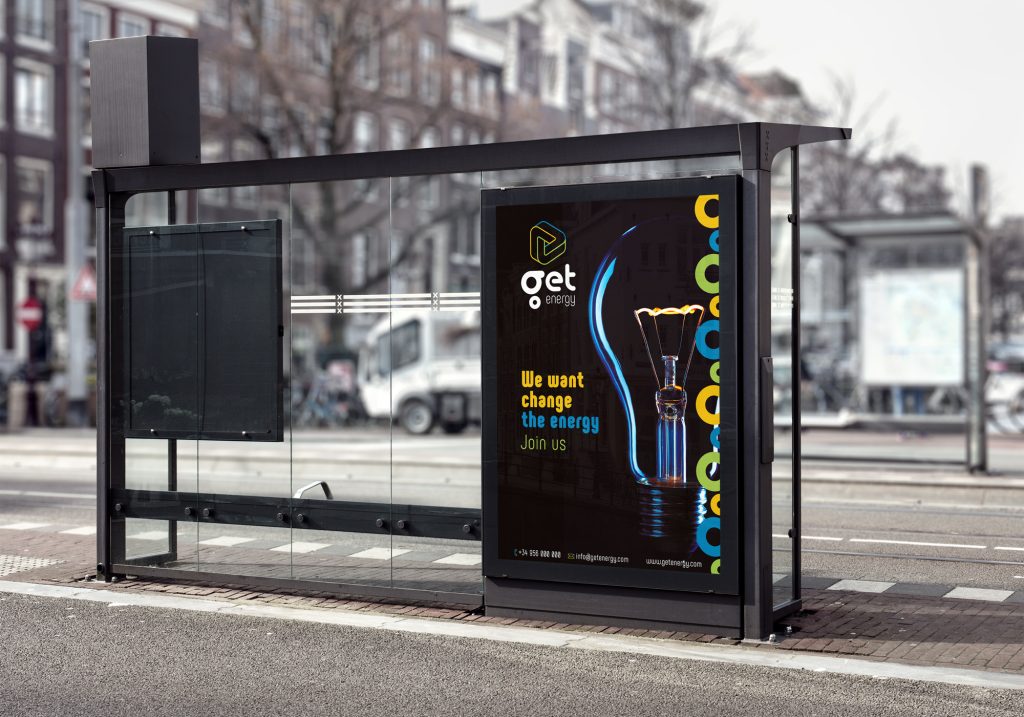
Mockup de cartel publicitario aplicado sobre marquesina de autobús.
Mockup de cartel publicitario aplicado sobre marquesina de autobús.
Visual image development for Get energy, which was born as a revolutionary company in the energy industry. Using technological resources, innovation and respecting the planet, Get energy transforms the way energy is consumed, making it more accessible to users.