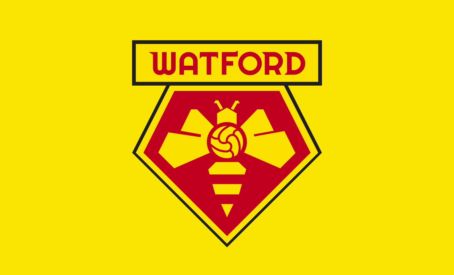
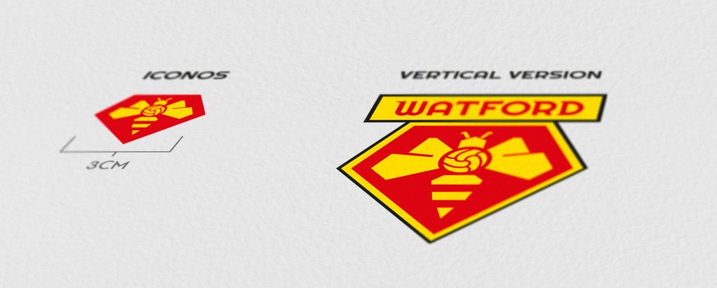
Se mantiene la forma del emblema actual, que es bastante característica e identificativa respecto a otros equipos de fútbol. Para representar a “Los hornets” nos basamos en la idea utilizada en el año 1972, pero sintetizándola al máximo, eliminando los detalles superfluos.
I keep he current emblem, which is quite characteristic and identifiable respect to other football teams. To represent “The Hornets” we based on the idea used in 1972, but synthesizing it as much as possible, deliting small details.
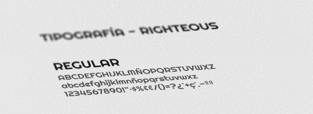
Creamos una tipografía especial para la ocasión, añadiendo remates en punta, en referencia a los aguijones de los avispones tan característicos y que a la vez aporta esa identidad propia que buscamos, dotándola de un carácter propio y con fuerza.
I created a custom typography, adding sharp serif, in reference to the stings of the hornets so characteristic and which, at the same time, provides the identity we are looking for.
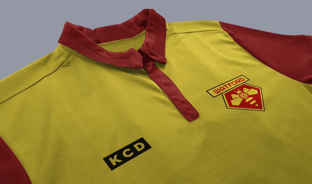
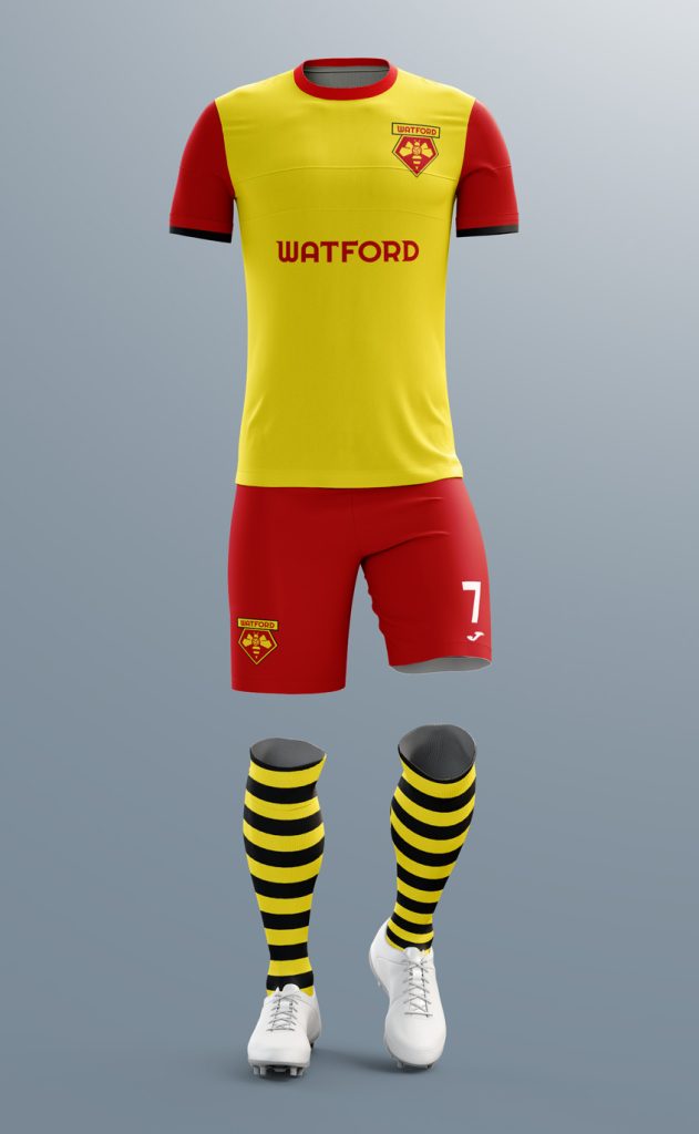
Watford FC is a Premier League soccer club based just outside London, United Kingdom, and is known as The Hornets. Ahead of the 2020/21 season, the club is giving designers from around the world the opportunity to design its new badge.
For years, fans have called the team “The Hornets”, but the official insignia has included a red hart, a type of deer, which does not at all identify the essence of the team and its fans.
This image was presented inspired by several concepts and ideas used in the club’s image throughout its history. The shape of the current emblem, which is quite characteristic and identifiable with respect to other soccer teams, is maintained. To represent “The Hornets” we based ourselves on the idea used in 1972, but synthesizing it as much as possible, eliminating superfluous details. The hornet’s body is an old soccer ball, placing it in the center of the emblem, symbolizing on the one hand the passion for this sport and being one of the longest-lived teams in the English league. From the soccer ball comes the shape of the wings, totally open, to express the unity of the fans with the team, forming a family.
We created a special typography for the occasion, adding pointed tips, in reference to the stings of the hornets, which are so characteristic and at the same time provide the identity we are looking for. The hornet designed inside the emblem follows the shape of the emblem itself with the same angle and direction in its strokes.